7 Small Shopify Improvements You Can Make Without Apps (And When You Need an Expert)
When a Shopify store is not converting well, the first reaction is often: “Which app do we need?” Reviews, pop ups, bundles, countdown timers – the list of possible add-ons is endless.
In our client projects at Defne Agency, we usually do the opposite. We start with small, structural improvements that do not require apps at all. These changes are simple enough for merchants to understand, but the impact on clarity, conversion and speed can be significant.
What you will get from this guide
- 7 practical improvements you can make inside the Shopify admin and theme settings.
- Examples of what is realistic to handle yourself vs. where code and UX work are required.
- A clearer view of when an agency or expert setup actually saves you time and money.
Why “no app” improvements matter
Apps are great when you have a clear strategy and a stable theme. But when the foundations are messy, apps simply stack more complexity on top.
Starting with no-app improvements helps you:
- Keep your store lighter and faster.
- Understand how your theme really behaves.
- See which problems are strategic, not technical.
Once those basics are in place, you will know much better what you actually need an app or a custom feature for – and what you do not.
1. Clean up your main navigation and structure
Many Shopify stores start small and then grow into a maze of menus and submenus. Customers land on the homepage, open the navigation and do not know where to click first.
Inside Shopify’s Navigation settings you can:
- Reduce your top menu to the 4–6 most important links.
- Group similar items under one clear label (for example “Bedding” instead of five separate links).
- Make sure the wording in your menu matches what customers actually search for.
This is the kind of change you can safely handle yourself. When you want to go further and build mega menus or custom navigation layouts that match your brand, that is typically where design and development work starts.
2. Focus your homepage on one main action
Homepage sections are easy to add. After a few months, many stores end up with sliders, banners, collections, blog posts and testimonials all competing for attention.
In your theme editor you can:
- Decide what the primary action should be: shop a collection, discover a new launch, or book a call.
- Move that section above the fold and make the button impossible to miss.
- Remove or push down anything that does not directly support that main action.
Rearranging sections is a no-code task. Redesigning the hero block or building a more strategic homepage layout is where an agency usually creates a custom set of reusable sections tailored to your brand.
3. Fix the basics on your product pages
Product pages are where most buying decisions happen. Before adding upsell apps or advanced bundles, make sure the essentials are clear and consistent.
You can already improve a lot by:
- Using clear, benefit driven product titles instead of internal product codes.
- Writing short, scannable descriptions with bullet points for key features.
- Making sure price, size, colour and stock info are not buried below the fold.
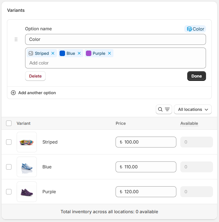
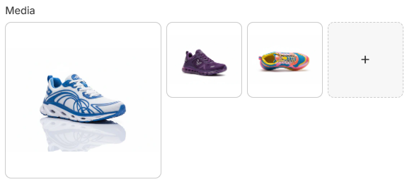
These edits are done in the product admin and theme settings. When you want to introduce more advanced layouts (for example different templates for B2B vs. retail), that is where custom templates and professional UX work make a difference.
4. Make collection pages easier to scan
Collection pages are often treated as simple product grids, but small tweaks here can dramatically change how quickly people find what they want.
From your theme settings and collection admin you can:
- Use clear collection names instead of generic labels like “All products”.
- Order products so bestsellers and hero items appear near the top.
- Turn on basic sorting or filtering options if your theme supports them.
If you find that your customers still struggle to filter by size, colour or use case, that is usually the point where custom faceted search or a specialist app becomes part of the solution.
5. Add simple trust elements where they matter
Before someone buys from a new brand, they look for signals that the store is real and reliable. You do not need heavy review widgets everywhere to create basic trust.
Quick improvements include:
- Making your shipping, returns and contact details easy to find in the footer.
- Adding a short reassurance line near the Add to Cart button (for example “Free shipping over £50”).
- Using a simple “About” paragraph or brand statement on the homepage.
When you want to systemise reviews, testimonials and case studies across the site, that is where a proper content strategy and design system become important.
6. Check the experience on mobile first
For most stores, the majority of traffic now comes from mobile devices. Yet many merchants still only review their store on a laptop.
In your theme preview:
- Switch to the mobile view and scroll as if you were a new visitor.
- Check whether buttons are large enough and easy to tap.
- Make sure text is readable without zooming, especially in banners and overlays.
Anything that just needs rearranging or hiding on mobile can be handled in the theme editor. If elements overlap, behave oddly or require different layouts entirely, a more technical review of your theme is needed.
7. Look at the right numbers in your analytics
The last “no app” improvement is not visual at all – it is about what you measure. Without basic analytics, it is hard to know whether the changes above are helping.
As a starting point, keep an eye on:
- Sessions to add-to-cart – are product pages doing their job?
- Sessions to checkout – are there issues on the cart or mini-cart?
- Overall conversion rate – is the store as a whole moving in the right direction?
Once you are comfortable reading these basics, more advanced tracking (server-side events, cross-domain tracking, multi-channel attribution) becomes useful – and that is the moment where a professional setup pays off.
Where apps and expert work actually start
After you have applied the quick wins above, your store will already feel cleaner and more focused. At that point it makes sense to decide where to invest next.
In our experience, merchants get the most value from expert help when they want to:
- Replace a generic theme with a faster, brand-specific setup.
- Introduce bundles, subscriptions or complex pricing logic.
- Run serious performance marketing and need reliable tracking across channels.
- Design a consistent brand experience across website, email and social media.
“You do not need an app for every small idea. Start with a clean foundation, then add only the pieces that truly support your business model.”
Conclusion
Not every Shopify problem requires a new app or a complete redesign. By cleaning up navigation, focusing your homepage, tightening product pages and checking the experience on mobile, you can make meaningful progress with the tools you already have.
When you have done what you can inside the admin and theme editor and still feel limited by the platform, that is usually a sign that you are ready for a more strategic setup.
At Defne Agency we help brands in the UK and EU bridge that gap – starting from practical quick wins and then moving into custom themes, performance optimisation and marketing setups that are built to scale.